The art of rivers
From Aretha Franklin to American Rivers, we talk with Allison Fisher, designer and manager of the Globe Collection and Press at MICA about the rock-n-roll history and grassroots spirit of Baltimore’s iconic, nearly 90-year-old music poster press.
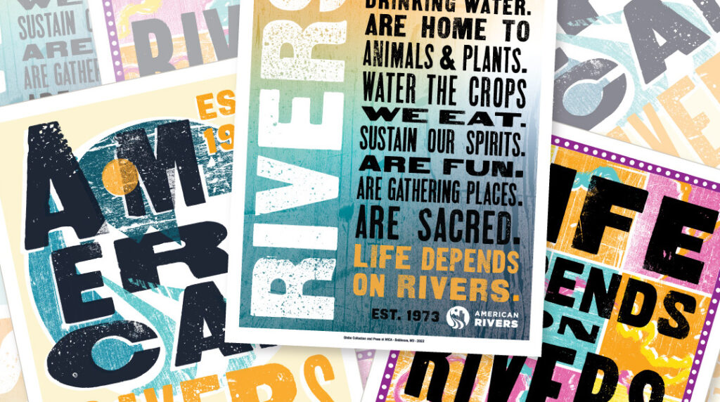
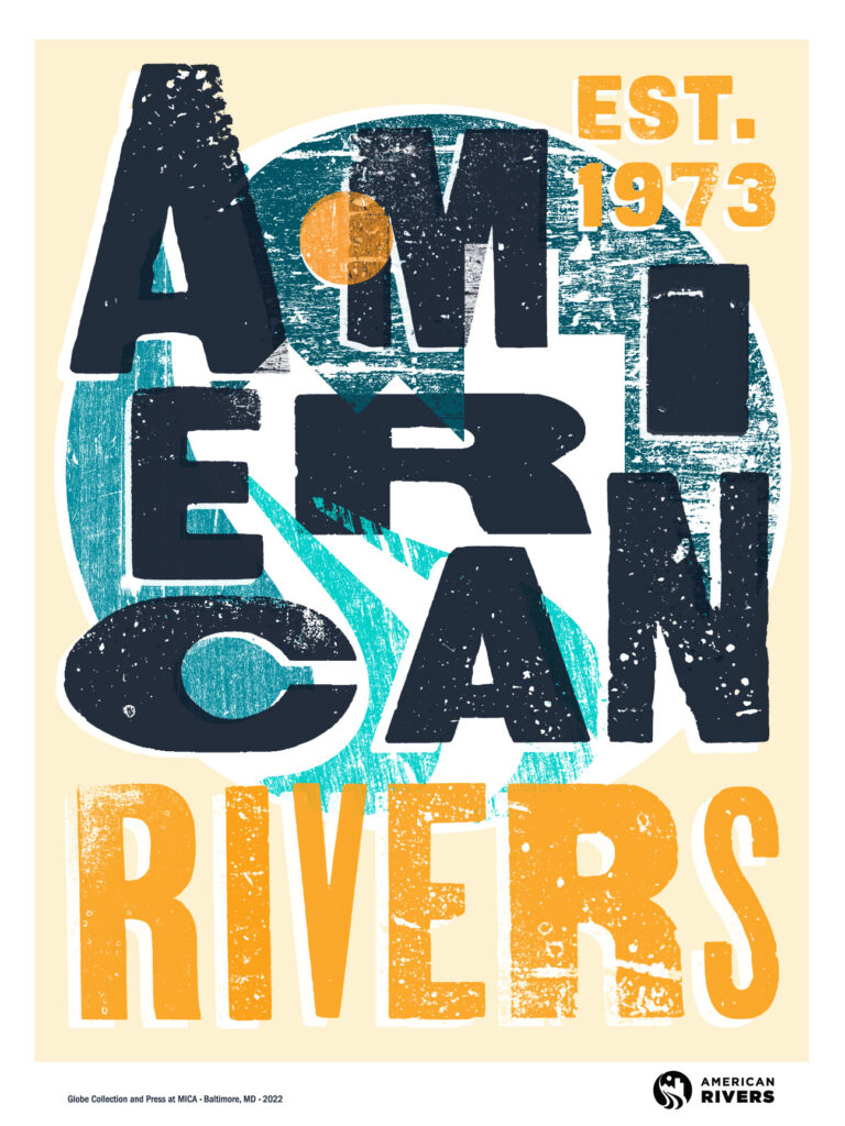
Art can inspire action! For our 50th anniversary, American Rivers is teaming up with five artists on original works that explore how important healthy rivers are to the future of humanity and nature.
The nation’s most iconic poster press Globe Collection and Press at MICA helps us kick off our five-part limited-edition art collection.
Learn more about Globe and visit AMERICANRIVERS.ORG/STORE to buy T-shirts, totes, posters, and more featuring this artwork and more from our 50th anniversary collection.
Globe has an incredibly cool history. Tell us about it.
Globe was founded in Baltimore 1929 and started out printing inexpensive posters for everyday people — so fairs, carnivals, boxing, racing, wrestling, big band. But it’s real claim to fame was in the 1950s and ‘60s with R&B and rock-and-roll posters for the likes of James Brown, Marvin Gaye, Aretha Franklin, Ike and Tina Turner, and B.B. King.
It was using a mixed-media process to produce these super-vibrant posters. Fluorescent backgrounds and bold black type became Globe’s trademark style. And its footprint wasn’t just Baltimore, it was sending posters everywhere from upstate New York down the Eastern Seaboard and along the Gulf into Texas.
That carried forward into the late ‘70s to early ‘80s with go-go music and early rap and hip hop. And it held on until about 2011. When Globe finally closed, there was a community movement of artists and designers, historians, and students that activated to find Globe a new home and keep it in Baltimore, where it’s always been. The Maryland Institute College of Art, MICA, stepped up and purchased it when the press was 81 years old. It is one of the largest intact collections of letter-press printing materials of its kind in the country, if not in the world.
What is Globe up to now?
Now Globe is what we call a working collection. It has three jobs at MICA. We teach with it and pass on the tradition of the letter-press craft. We’re also slowly working on archiving the collection so it can be used for research and scholarship. And we also make new work with it. We’re using all of the great type and tools and stylings that made Globe famous. MICA has given us a lot of freedom to try a lot of different things. The collection has a really nice balance of commercial work, but we also do a lot of nonpartisan voter civic participation stuff and community-based projects.
Can you describe the process that Globe used to create the posters for American Rivers?
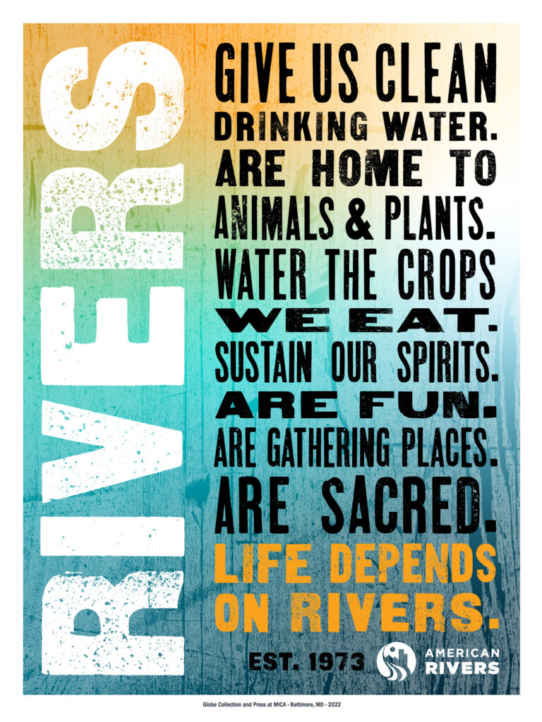
With any project, we always look to our archive materials as a place to start, whether it’s posters or wood blocks in our collection. This project with American Rivers was a little bit different because most of the time we design posters that need to be screen printed and letter pressed one at a time. This was a fun one because we didn’t have those same constraints. It gave us a lot of room to play with the wood type and the texturings from the collection to build up different layers.
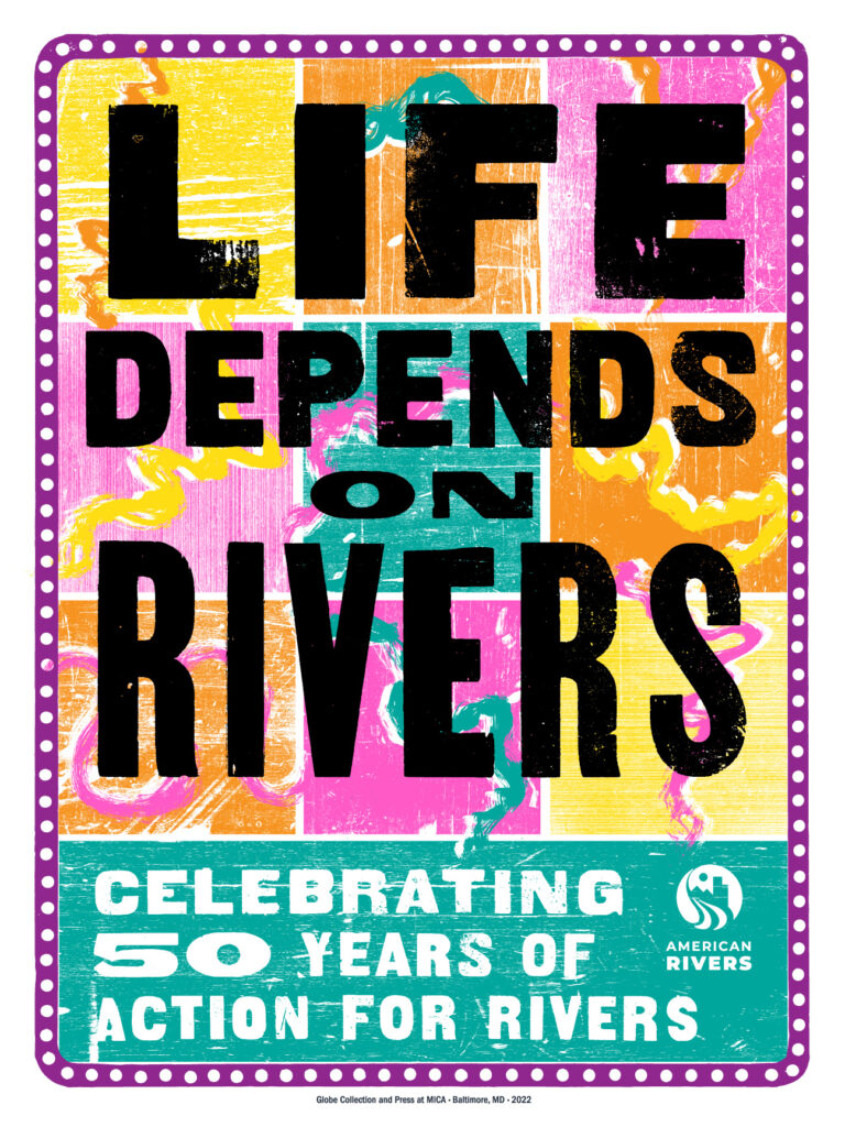
For example, take the poster that says, “Life Depends on Rivers.” That is the one that is most classically Globe, with a colored background and black wood-type text on top. We pulled the idea of the background from American Rivers’ annual list of America’s Most Endangered Rivers®. The background for that poster is made up of wood-type textured graphics of our loose interpretation of what the shape of those endangered rivers look like.
What inspired you about this project?
There’s a really nice symbiosis of using wood type as the base of these graphics. Because without rivers, trees don’t grow. We are kind of coming full circle in the materials that we’re using to do this design work — because it wouldn’t exist without water in rivers.
I really like design where you are constantly finding more information about it, whether it’s subtle moments where two pieces of type overlap or a color hits or something shifts just a little bit. I like those really quiet moments in design where things sync nicely or in a way you don’t necessarily expect them to.
To learn more about our Globe collection, please visit the American Rivers’ store.
